I’ve sent a good deal of the last few columns in the world of Artificial Intelligence, and its consequences for the working environment. So I thought I would try and avoid referring to it this month, apart from in that last sentence. Instead I will look at things that are very much real and practical, many of which we take for granted in the print world, but which are essential to understand to tackle the digital world and abandon all human calculations to the computer.
I’m very aware that while print on demand is one of the more traditional trades, many people will have joined the workforce in recent years without an apprenticeship in paper, and from a background that is much more digital based. As a result it’s worth going through the basics to appreciate how one transfers to the other.
We tend to accept A-sizes for sheets of paper as a matter of course, but that hasn’t always been the case and North America still uses inches which is why printer dialogue boxes default to letter and other redundant dimensions not used In Europe. It’s also why large format machines still come in simple increments of feet rather than more obscure millimetres.
Napoleon is often credited with having a hand in the introduction of the metric system of measurement, but that is no more accurate than Ridley Scott’s portrayal of him leading a cavalry charge at the Battle of Waterloo when he was actually in an inn down the road.
Standardisation of sizes, as well as weights and distances was essential from early days otherwise exchange of trade was impossible. There had to be recognised values for equivalent goods and monies. In fact, without a standard scale of time and distance you couldn’t even arrange a meeting to trade at all.
Standard paper sizes were just a small part of this, but a very practical one as it meant an efficient use of an expensive resource. Print machines could be built to specific dimensions, and enlargements or reductions made to simple equations. It may not seem so if you are using irregular percentages to copy originals, but the A standard has its own logic. A0 is actually a square metre in surface area, and an A1 is an A0 cut in half just once to create two equal pieces. An A4 is the same sheet chopped four times to create 16 clones and so on. Simple when you work it out that way and ignore the often confusing dimensions and accept that the longest side of an A4 is the same as the shortest side of an A3 and so on. That way you know that an A5 card fits perfectly on a piece of A4 folded and that it also conveniently slides into an A5 envelope.
The Americans may not accept the standard, but the Chinese do so. That's a fairly big chunk of humanity working to the same hymn sheet. Having a standard scale of sizes also means you can have a standard and easy to calculate scale of pricing. It’s not perfect, because of course customers don’t always want standard sizes but it does give an approximate guide to cost, and when complimentary things like envelopes and frames are also general in standard sizes, it makes sense.
Having a standard size to print also makes it easier to work out the shape of an original image - the real dimensions rather than the ideal ones - which has become more difficult in digital days. When it was just a hard copy you could see the original was square so would have white spaces.
With pixels it's a bit more elusive to work out the relationship between width and height. It doesn’t help that customers get confused as to which is which, and therefore what size they really want. This relationship is often called the Aspect Ratio but it’s nothing more complicated than the fixed dimensions so that if you change them, you will be altering the shape of the output. Keeping the same ratio, you may need to reduce or enlarge proportionally to fit the paper, or crop parts that are not needed for print. It’s the same old reproduction issue, but working with pixels you can drastically transform the shape and perspective of the original if you are not careful so it can be a bit of a minefield.
Photoshop is a great aid in that it faithfully displays a digital file to the exact pixel dimensions. So you see what you have got. Unlike other programmes the PS workspace is pixel dependent, so if you have a 72 dpi file, that’s what it will show you, dot for dot. It does mean that if you import another image with a slightly different number of pixels, it will be a different size, smaller or large depending on the content. So it’s always important to check, especially because the customer won’t have.
The reason we get lots of variation in sizes is simply because customers are no longer working on A4 sheets of paper or pads of regular dimensions. Screens of phones and tablets are all different ratios between the top and the sizes so it’s not surprising they have very little understanding of shape, let alone resolution.
The latter determines to some degree how large you can go in terms of print - one of the most common questions asked. But it’s by no means a hard and fast answer as clarity and appearance are far more subjective facts than stark mathematics. All picture files - whether taken on camera, phone or downloaded from the internet, even scanned at high resolution - are dependent on the number of pixels captured. But the quality of those pixels, not the quantity, is the important factor.
An image may have a relatively small pixel count yet still be quite acceptable at a certain size. The pictures on a cinema screen or a widescreen television are not actually high resolution, but then you are viewing from a distance rather than having your nose up against it. It’s very much a human eye judgement, balanced alongside the context where it will be used, that’s why any automated system for checking a file’s integrity will always be flawed. It can tell you how big it is, but not how good it is.
While the 300dpi rule is the standard guideline for printing around A4 size, especially if text is involved, at large sizes, 200 or even 100 dpi can be acceptable as long as the source has enough pixel information.
As most phone cameras now shoot images of several thousand ppi there’s usually enough for a decent print as long as the customer hasn’t downsized it to a ridiculously small size. Also phones are able to capture a variety of perspectives so the file may not always fit the more standard 3:4 ratio which is near enough to an A size print, or fit a standard frame if it is to be placed neatly in one.
The other elephant in the room - and it’s a big one - is colour of course. When dealing with a hard copy original there was a real colour you could see, even if you couldn’t always replicate it accurately. With a digital file, however created, the only relative colour is buried in the complex formula embedded in it on its creation. The more this has been done by purely automatic processors, whether via camera lenses, scanners, or designers who think they know what they are doing, the more room there is for error.
 |
As an old Epson engineer once said to me in the early days of my large format journey, ‘when you begin to understand what can go wrong, it’s amazing anything comes out at all, let alone the right colour’ It was back then I was introduced to the concept of metamerism. This is a big word for a very simple physical fact which we all actually know, but rarely take account of. It’s how colours look different in alternative lighting conditions - whether dawn or dusk, soft golden candlelight or bright neon fluorescents.
We see the light that falls upon the surface it reflects from. The colour of the object hasn’t changed. A fire engine is still red even if after dark under street lights it looks orange.
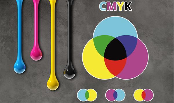
So obviously things will look different printed on any paper compared to how they appear on a backlit screen, but there is much more to that than illumination, especially in attempting to match the wide gamut of red, green and blue rainbow selection, with the much more limited magenta, cyan, yellow and back of ink and toner.
In the early days of the internet there was an attempt to standardise colour with a slightly reduced sRGB option - you can find it in Web Colours in Photoshop as a reference. And while that may work for websites so we are all looking at more or less the same thing, it’s no different from looking at someone else’s television screen. The colours never quite match.
Without delving too much into the black art of calibration, there is one simple thing you can do to close the gap between what you see on the screen and what you can print. After all the problem is usually a colour the customer has chosen that doesn’t match what comes out, and it's no good debated pantone colours and hex numbers because if the printer can’t print it, no amount of magic will make it change its mind.
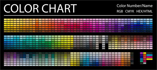 |
If you take a decent colour chart with the widest range of colours and print it on whatever printer, and with standard settings, that will give you a good guide to the possible. You can even give a copy to a particularly fussy customer to take away to his home or work environment to compare and decide which particular shade of beige is acceptable. It will save a lot of time in trying to do anything with printer settings, or in pre-print altering the colour hue in the file. I learned early doors you can go round in circles trying to please a client and end up with something not too far from where you started.
The colour chart will contain the RGB and CMYK values of all of the colours, so you can refer to any particular one. Frequently the difference between one and another is only a matter of density which is crucial when laying down printed colour, and obviously less so with projected light.
Keeping it simple is the key. Customers don’t want complicated solutions, and you can’t afford to indulge them so the easier you can make the whole process the better. After, all we are print on demand, even if those demands are sometimes beyond what is possible. At least we can show what can be done, and at what price, and give the customer the choice.
www.bestblogsinprint.co.uk/blog/keep-it-simple